Case study 01 / 06 · Louis Vuitton · Native mobile app
Turning a tool advisorsavoided into one they open first
Louis Vuitton's sales advisors use a clienteling app to know their clients and follow up with them. It was so hard to use that advisors avoided it. I led the redesign, from research to worldwide launch.
In 30 seconds
- +24%monthly active users
- +47%appointments booked per day
- +25%client outreaches per day
- 15K+advisors in 466 stores
- The problem
- A cluttered, outdated app. Advisors skipped it, so the brand lost client data and follow-ups.
- What I did
- I led research, prioritization, UX, UI and the design system, and managed the design team until launch.
- The result
- Launched worldwide in October 2021. Advisors now spend more than 2 hours a day in the app.
- Role
- Lead Product Designer
- Team
- 3 designers I led, LV business and dev teams
- Research
- 4 interviews + store visit
- Product
- Native mobile app · Internal tool
Advisors had stopped using their own app
Clienteling is a long game: the better an advisor knows a client, the more likely that client comes back. The app is where that knowledge lives. But booking a task or finding a client's history took too many taps, so advisors used it less. Fewer entries meant less client data and fewer follow-ups.
The app I started from


An outdated design
Advisors found the app unengaging and hard to use: an old look and no clear visual hierarchy, so nothing told them where to look first.
Usability issues
Booking a task was difficult, information was cluttered and hard to scan, and the layout didn't follow what advisors actually needed to do.
The question I set out to answerHow might we make the app the fastest way for advisors to act, in the few seconds they have between two clients?
What the business needed
- More loyal clients
- Better client data
- More efficient advisors
What advisors needed
- Act fast between two clients
- Find client info without digging
- Managers: see what the team has left to do
Constraints
- Must feel like Louis Vuitton
- Used standing, on the shop floor
- Existing dev team and tech stack
My role, from first interview to launch
I was the Lead Product Designer. I managed my own design team and worked day to day with the Louis Vuitton business team and the development team.
- 01
Research
I interviewed 4 users (2 advisors, 2 store managers) and observed a team on the floor of the Tel Aviv store.
- 02
Prioritize
I ran a Lightning Decision Jam with stakeholders, then split the roadmap into quick wins and long-term work with an Impact vs. Effort matrix.
- 03
Design
I built the app map, user flows, wireframes and prototype, then the LV_DS design system and the final UI.
- 04
Test
I tested the prototype with advisors and managers, and changed what didn't work.
- 05
Ship
I ran design QA during development and followed usage after launch.
Ajoute la taille de ton équipe et celle de l'équipe dev (ex. « 2 designers, 1 PM, 4 devs »), et la durée du projet avant le lancement de 2021.
Listening to advisors, on the shop floor
I interviewed 4 people: 2 client advisors and 2 store managers. Then I spent time with a team in the Louis Vuitton store in Tel Aviv, to see how the app fits into a real, intense day on the floor.
What I asked
- 01
Is the app fully adopted in your daily workflow? Why?
- 02
Do the app's features help you build relationships with clients?
- 03
How much time do you spend in the app, at least and at most?
- 04
Feature by feature: what helps you, and what gets in the way?
In the store
Two users, two views

Emma
Prepares announcements and information for the store and her team. Needs a full view of store performance, team activity and client interactions.

Mathews, 34
Experienced in luxury retail. Needs a fast, intuitive tool to manage his clienteling tasks, find client information and track his performance.
Mapping what we heard
After the interviews and the store visit, I mapped everything we heard around the app. Six areas came out, and they set the priorities for the workshop.
View as text
- Speed: Between two clients, Too many taps, Booking a task is hard
- Client knowledge: History hard to find, Lists all look alike, No reason to reach out
- Context: Standing on the floor, One hand free, Constant interruptions
- Brand: Outdated look, No visual hierarchy, Must feel Louis Vuitton
- Managers: Team activity, Store performance, Announcements
- Motivation: Badges unused, Visual noise, No visible impact
From interviews to a shared roadmap
I went back through every interview recording and grouped what people said, to see which topics really mattered to them. Then I ran a Lightning Decision Jam workshop on Miro with the stakeholders: capture problems, prioritize them, turn them into solutions.
From there I built a roadmap with an Impact vs. Effort matrix: quick wins first, bigger changes planned for later phases. After the workshops, I led my team in building a concise app map and analyzing every user flow.
Three insights that shaped the design
Advisors don't browse. They open the app to do one thing, between two clients.
replaced the menu-based home with widgets. Each widget leads to one action: book, follow up, or upgrade a client.
Managers and advisors read the same data for opposite reasons: one to monitor the team, the other to act on their own clients.
designed one app with two role-based views, instead of one compromise screen or two separate apps.
Gamification wasn't working. A manager told me she didn't know if her team used the badges at all.
cut badges back to a minimum and gave the space to features that save time.
From eight screens to one tap
The old app opened on the advisor's profile, and every action meant digging through menus. The new home asks who you are, then puts the next action one tap away.
- Open app
- Profile page
- Agenda list
- Client lists menu
- List
- Client
- Find history
- Create task
Where advisors gave up
- Home widgets
- Book · Follow up · Upgrade
- Done
- Team overview
- Store performance
- Announcements
LV_DS: a design system for the whole app
I created the LV_DS design system to renew the app's visual identity: a soft palette, typography and iconography that reflect the Louis Vuitton brand, and components built in Figma so the team could design and build faster, with one source of truth.
Before & after: the 3 screens advisors use most
These three screens carry most of an advisor's day. For each one: what was wrong, and what I changed. The new screens scroll on their own, like on a phone.
Home: from a profile page to a daily cockpit
The old home opened on the advisor's profile and a long list of appointments. Nothing told them what to do next.

- 1
Today's appointments, priorities and opportunities at a glance, as widgets
- 2
Each widget leads to one action: book, follow up, upgrade a client
- 3
Client stories at the top for fast access to key clients
Client lists: from a grey menu to curated collections
Every list looked the same: a grey row, a number and a chevron. Advisors had to remember what each list was for.

- 1
Key segments shown as visual cards with the brand's imagery
- 2
Lists grouped by purpose: segments, more lists, favorites
- 3
A new My Favorites section for the lists advisors use daily
Inside a list: from names to opportunities
The old list showed a client name, a spend amount and a date, with no reason to contact anyone.

- 1
Each list explains why it exists and what to do with it
- 2
Opportunity cards (to upgrade, to reactivate) turn data into actions
- 3
Spend and last purchase on every client, with sorting and filters
More screens from the final product


What testing changed
I tested the prototype with a diverse group of advisors and managers. It showed usability issues we hadn't seen, and confirmed which new ideas worked. I refined the design after each round.
The biggest change: gamification
Badges and challenges to motivate advisors to complete tasks.
Managers couldn't tell whether the team used them. They added visual noise without clear value.
Gamification reduced to a minimum. The space went to task-oriented widgets that cut clicks.
"I love to see widgets. They help me complete a specific action or give me information I can use right away."
Client Advisor, user testing"To be honest I don't really know if my team uses the badges and completes them."
Store Manager, the insight behind scaling back gamificationWhat changed after launch
I stayed with the development team through the build and the relaunch, solved design questions as they came up, and followed feedback and engagement after launch. In the following months, every key usage metric went up.
Monthly active users
Worldwide, March 2021 to May 2022. Highlighted bars: after the new app launched.
View as table
| Month | Active users |
|---|---|
| Mar 21 | 11.9K |
| Apr 21 | 11.3K |
| May 21 | 11.0K |
| Jun 21 | 12.0K |
| Jul 21 | 12.4K |
| Aug 21 | 12.3K |
| Sep 21 | 13.4K |
| Oct 21 | 13.5K |
| Nov 21 | 13.8K |
| Dec 21 | 14.1K |
| Jan 22 | 14.5K |
| Feb 22 | 14.6K |
| Mar 22 | 14.7K |
| Apr 22 | 14.9K |
| May 22 | 14.8K |
What I learned
Accessibility & inclusion
- Built for standing, one-handed use.
- One clear next action per screen.
- Each role sees only what it needs.
Define how we measure an engagement feature before designing it.
Relis cette réflexion et adapte-la à ce que tu as vraiment retenu de ce projet.
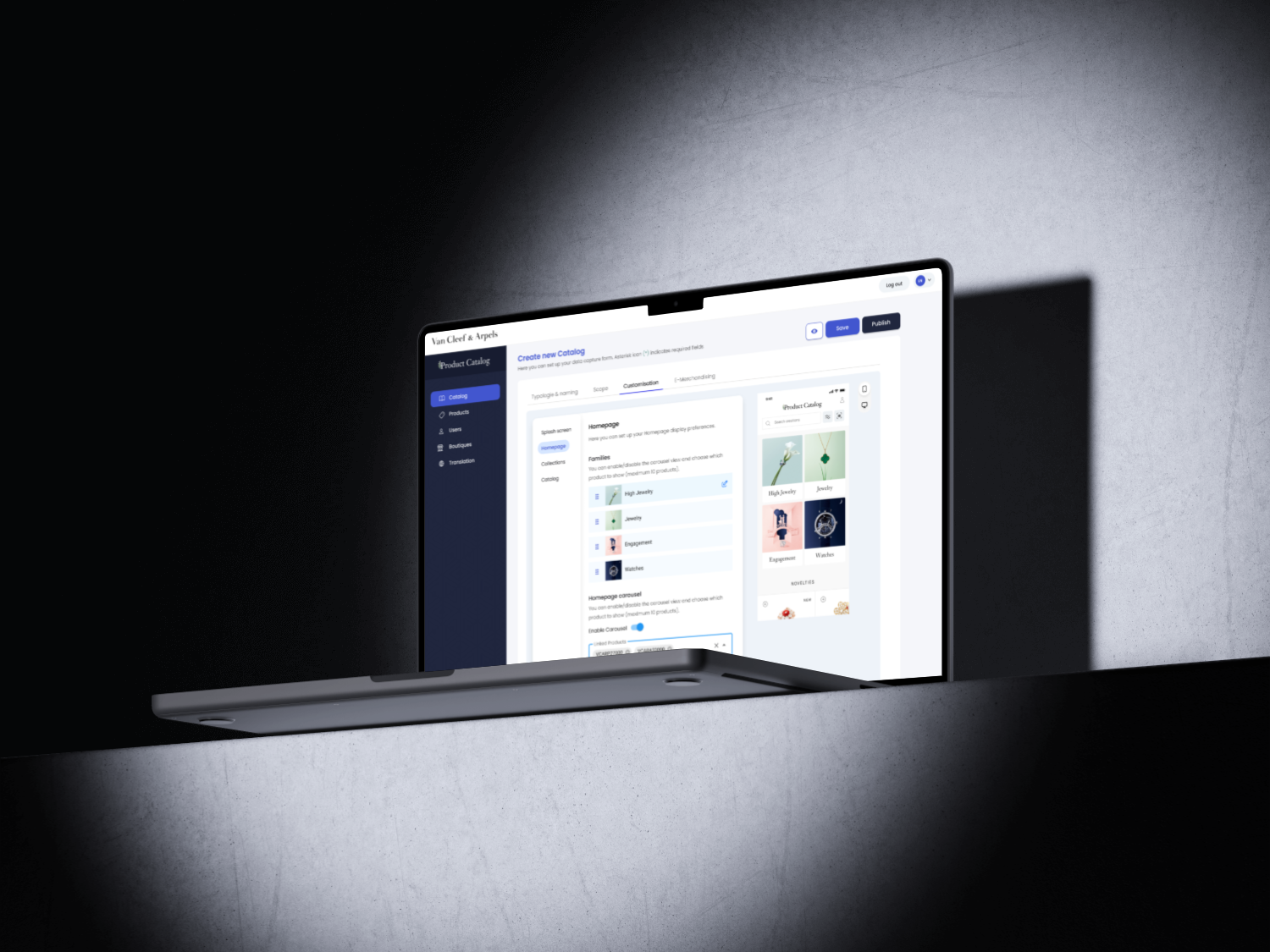
Product console: one source of truth for 5 products
One back-office console feeding tools for sales teams and experiences for clients, up to the VIP High Jewelry app.
Read the case study