Case study 06 / 06 · Optical Center · Responsive website
Buying glasses,without the friction
Optical Center is an international optical and hearing retail chain. Buying glasses on its website took too many steps, and too many people left at checkout. I redesigned the purchase journey.
In 30 seconds
- 5user interviews to find where people dropped
- 2ways to buy: Quick Buy or guided
- 5key journeys redesigned, from catalog to store locator
- 1design system: Clarity & Heritage
- The problem
- A long purchase journey, an outdated look and a confusing checkout drove people away before they bought.
- What I did
- I ran user research and a competitive analysis, led the roadmap with product managers, and designed the architecture, design system and UI.
- The result
- A shorter journey with Quick Buy, virtual try-on, a new store locator and a design system used on every page.
- Role
- Digital Design Lead
- Team
- 2 designers I led, product managers, client teams
- Research
- 5 user interviews, site audit
- Product
- Responsive website · E-commerce
Too many steps, so people left before buying
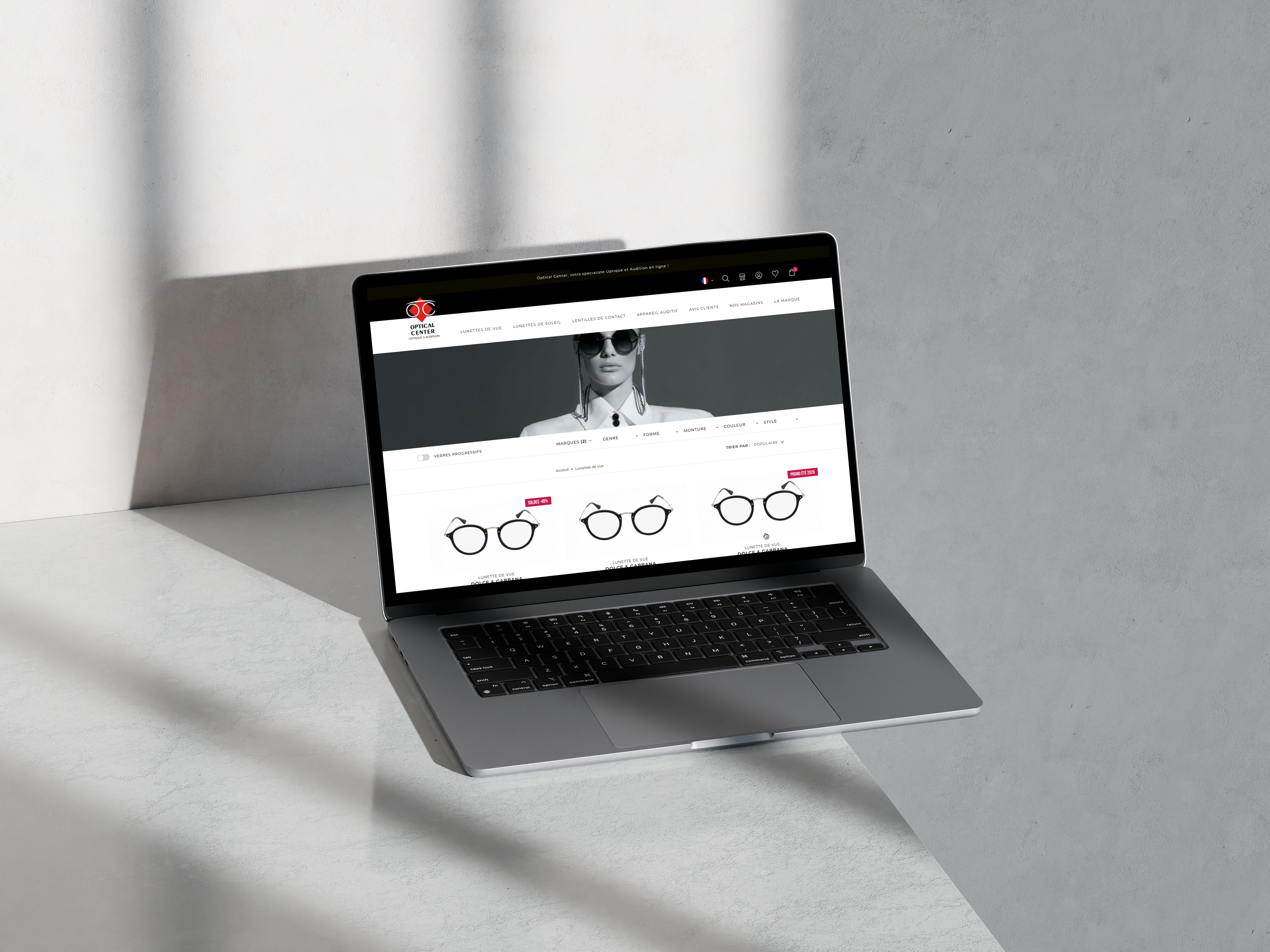
Optical Center is an international optical and hearing retail chain. User satisfaction was falling: buying glasses online meant a long journey, an outdated interface and a checkout that wasn't clear about costs. Many people gave up at the last step.
A purchase journey with too many steps
Lens type, options, prescription, account, shipping: one long funnel for everyone.
An outdated web presence
An old look that did not reflect a modern, premium brand.
High cart abandonment
Unexpected costs, a confusing checkout and doubts about payment.
Content that didn't help
Promotions everywhere, little guidance to choose the right pair.
The question I set out to answerHow might we help people buy glasses online with fewer steps and more confidence?
Listening to people who buy glasses
I audited the existing site and interviewed 5 people who buy glasses. I wrote every observation on a sticky note, then grouped them by theme. Four themes came out, and they shaped everything that followed.
Too many steps
- Gives up when asked for lens options
- Doesn't know their exact prescription
- Wants to re-order the same frame fast
Can I trust it?
- Shipping cost appears only at checkout
- Unsure the frame will suit their face
- Prefers to finish in store
Help me choose
- Too many frames, no clear filters
- Promotions hide the real price
- Wants advice like in store
I'm on my phone
- Browses on mobile, pays later on desktop
- Small buttons, long pages
- Looks for the nearest store on the go
Affinity mapping, recreated from my research notes.
Mapping the problem space
Before choosing what to build, I mapped the whole problem space. Six areas came out of the research, the audit and the workshops with the product managers.
View as text
- Purchase journey: Too many steps, Lens options unclear, Prescription entry
- Trust: Hidden costs, Payment doubts, Can't try before buying
- Discovery: Decision fatigue, Weak filters, Irrelevant content
- Brand & UI: Outdated look, Primary color misused, Slow pages
- Mobile: Most traffic on phones, Desktop-first layouts, Small tap targets
- Omnichannel: Find a store, Book an eye exam, Stock in store
Two paths instead of one long funnel
The old site pushed everyone through the same long funnel. The new journey asks one question first, then splits: a fast track for people who know what they need, and a guided path for the others.
- Home
- Category
- Listing
- Product
- Lens type
- Lens options
- Prescription
- Cart
- Account
- Shipping
- Payment
Where people dropped
- Product
- Saved prescription
- Pay
- Smart filters
- Virtual try-on
- Clear lens packs
- Pay or book in store
From quick wins to a new experience
With the product managers, I listed every problem across UX, content, design, development, support and operations, then turned them into a roadmap and a backlog. Quick wins first, bigger changes in later phases.
Fix the funnel
- Shorter checkout, every cost upfront
- Quick Buy for returning clients
- Mobile-first product page
Build confidence
- Virtual try-on
- Clear lens packs
- New store locator
Personalize
- “Clarity & Heritage” on every page
- Personalized content
- 3D store tours and social

A sitemap, mobile-first wireframes and a design system
With priorities set, I mapped every page and path into one sitemap, wireframed mobile first, then built the “Clarity & Heritage” design system on five principles: sophisticated simplicity, timeless elegance, inclusive luxury, personalized clarity and expert craftsmanship.


The final website, in motion
Press play, or pick a chapter: the prototype walks through the final screens. The website is live, so you can also see the result for real.
Quick Buy
Order in a few clicks when you already know your prescription and frame.
Virtual try-on
See the frame on your face before you buy.
Shorter checkout
Fewer steps, and every cost shown upfront.
New store locator
Find a store by city and book an appointment.
What I learned
Accessibility & inclusion
- Mobile-first: every page was wireframed for small screens before scaling up.
- Two speeds: a fast path for people who know what they need, and a guided path for the others.
- A design system with “inclusive luxury” and “personalized clarity” as principles.
What I'd do differently
Reducing friction isn't only about fewer steps. It's about removing the moments where people stop trusting the purchase.
Relis cette réflexion et adapte-la à ce que tu as vraiment retenu.
Louis Vuitton: Clienteling app
Redesign of the app advisors use to build lasting relationships with their clients.
Read the case study