Case study 05 / 06 · Van Cleef & Arpels · Native mobile app
High Jewelry,in the hands of top clients
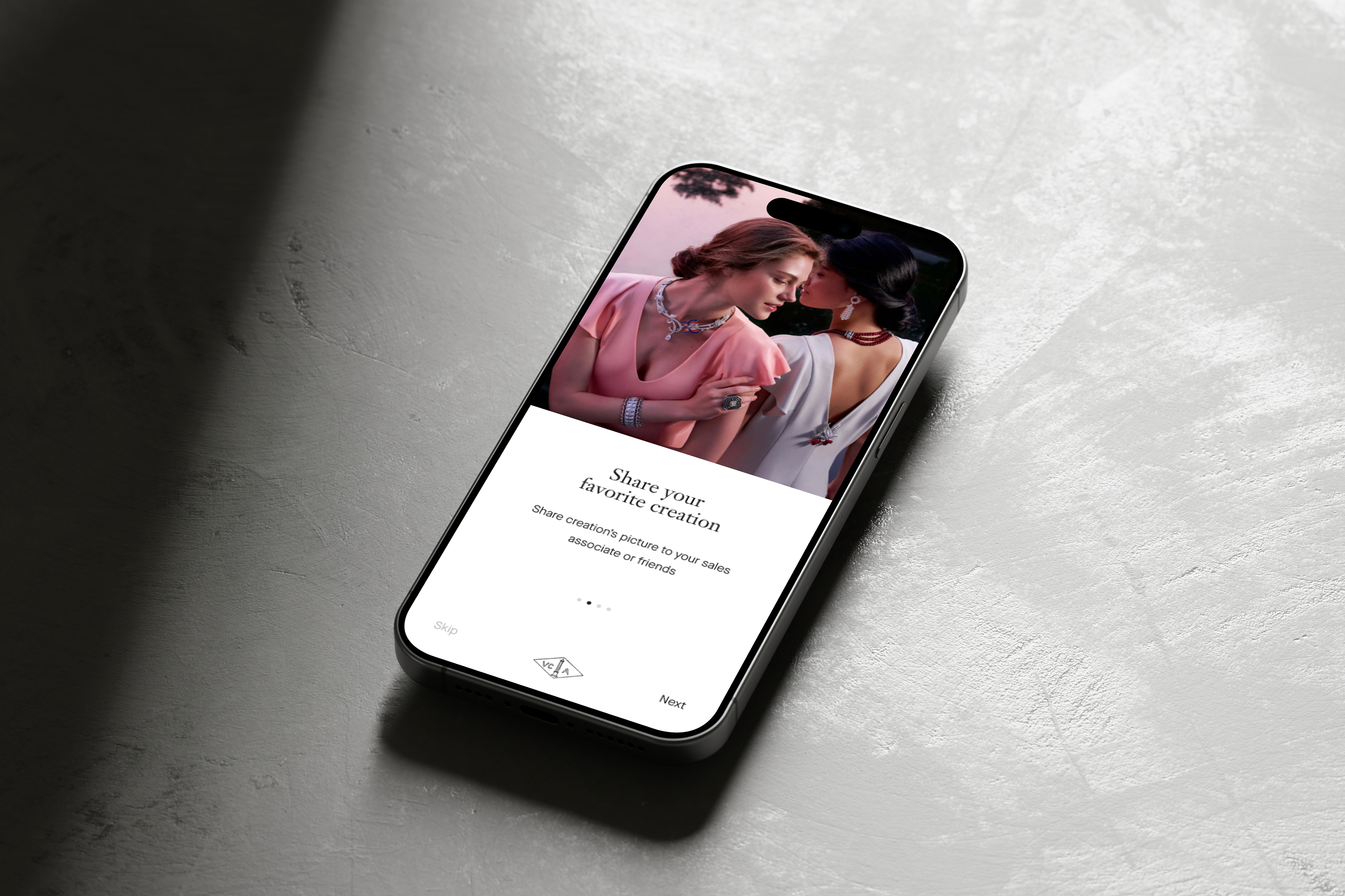
Van Cleef & Arpels reached its most exclusive clients mostly through in-store invitations and events. Between visits, there was no personal, digital way to show them new creations. I designed a private app for them.
In 30 seconds
- 1:1line to a dedicated advisor
- 4sections only, for every digital level
- Localprices in each client's market
- 2visual directions, the second validated in testing
- The problem
- No digital way to show High Jewelry to top clients worldwide, or to keep the advisor relationship going between visits.
- What I did
- I led research, structured the app with Object-Oriented UX, built the design system and UI, and rethought the visual direction when the first one fell short.
- The result
- A private app with the full High Jewelry catalog, local pricing and a direct line to an advisor, validated in user testing.
- Role
- Design Tech Lead
- Team
- 4 designers I led, VCA business team
- Users
- Top clients, dealers & advisors
- Product
- Native mobile app · Clients
Exclusive clients, but no way to reach them between visits
Top clients discovered High Jewelry mainly through the website, in-store invitations and events. That limited personal outreach and remote engagement, while competitors made buying online easy.
The question I set out to answerHow might we bring High Jewelry to top clients worldwide, remotely, without losing the personal relationship with their advisor?
What the business needed
- More High Jewelry visibility and sales
- Loyalty services for top clients
- An answer to easier online buying
What users needed
- Clients: see creations remotely, on their own time
- Clients: keep a personal link with their advisor
- Advisors: tools for one-to-one relationships
Constraints
- Clients with very different digital habits
- A brand with an extremely high bar for craft
- Prices and availability vary by country
My role, from interviews to the final UI
I was the Design Tech Lead. I led a team of 4 designers, and VCA's business team reviewed each direction.
Step 1: Research
I interviewed stakeholders and audited how VCA reached its clients across channels.
- Stakeholder interviews
- Channel audit
- Business goals
Step 2: Structure
I wrote personas and used Object-Oriented UX to define the app's core objects before drawing any screen.
- 2 personas
- Object-Oriented UX
- 4 core objects
Step 3: Design
I built the app map, user flows, wireframes and prototype, and a design system based on VCA's web UI.
- App map
- User flows
- Wireframes
- Prototype
- Design system
Step 4: Rethink
When the first visual direction lacked luxury refinement, I reworked it completely, then refined it again after user testing.
- Brand immersion
- V1 → V2
- User testing


Ajoute la taille de l'équipe et la durée du projet.
Three insights that shaped the app
High Jewelry isn't bought in a cart. It's bought through a relationship with an advisor.
let clients start a purchase in the app, then hand over to their dedicated advisor. No instant checkout, on purpose for this category.
Top clients range from very digital to barely digital.
used Object-Oriented UX to reduce the app to four clear sections: Highlights, Catalog, Selections and Settings, with generous, readable layouts.
A price only means something in the client's own market.
showed the local recommended retail price on every product.

When the first direction wasn't right
A first UI, chosen after internal feedback, built from VCA's web interface.
It lacked luxury refinement and didn't balance the brand's fairytale and modern sides.
I immersed myself in the brand's world and reworked the whole visual approach, then refined it again after user testing.

User testing then changed the type hierarchy, palette, white space, UI copy and interactions.
The final app, in motion
Press play, or pick a chapter: the prototype walks through the real journey of a client, from the invitation to a shared selection.

Interactive prototype · final design
Built from the final screens. Animations and transitions are added to show the journey; pause it at any time.
Global catalog
Every High Jewelry collection, accessible worldwide.
Local pricing
Detailed product information with local recommended prices.
Advisor link
A one-to-one relationship with a dedicated advisor.
Selections
Clients keep the creations they care about.
What I learned
Accessibility & inclusion
- Clients ranged from very digital to barely digital, so the app has only four sections.
- Generous, readable layouts and a clear type hierarchy, refined after user testing.
- A human stays in the loop: clients can start online and finish with their advisor.
What I took away
Even with a brand this strong, UI decisions have to start from how people use the interface, not from admiration for the brand.
Optical Center: Website revamp
A mobile-first purchase journey with fewer steps, virtual try-on and a new design system.
Read the case study